Button elements are used to navigate between pages or open a link. With this element you can add multiple buttons which can be aligned to your preferences.
ADDING BUTTONS

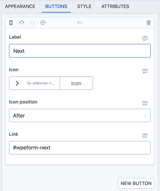
Go to BUTTONS from config and click on the NEW BUTTON.
- Label - Text shown inside the button.
- Icon - Icon used inside the button, beside the text.
- Icon position - Whether to place the icon before or after the text.
- Link - What to do when the button is clicked. More information below.
BUTTON LINKS
There are two types of links for the button.
ANCHOR LINK
Any link starting with http or https will be treated as an anchor link and
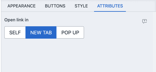
will take to the specified URL. You can change how links are opened by going to
ATTRIBUTES and changing the Open link in configuration.

NAVIGATION LINK
When the following strings are placed in the Link config, navigation actions are performed. The buttons will automatically disable itself or animated based on context.
#wpeform-prev- Go to the previous page.#wpeform-submit- Submit the form. Will animate when the form is submitting.#wpeform-next- Go to the next page.
STYLING BUTTONS

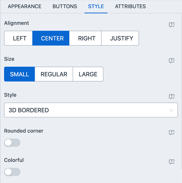
Go to the Style configuration to change how buttons appear.