Learn different form elements and how they operate in WPEForm WordPress Form Builder.
Different Form Elements in WPEForm WordPress Form Builder


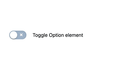
Add and configure Toggle Option Element in WPEForm
Toggle option is great for on/off type user input. It can either be selected or not selected. CHANGING LABELS AND ICONS On and off state labels and icons can be changed through the INTERFACE tab. T…
Continue Reading…

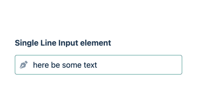
Add and configure Single Line Input Element in WPEForm
Single line input or simply a text input is the input[type="text"] element with advanced features. It lets you collect text input from your users with a bunch of validation. This is also the same e…
Continue Reading…

Add and configure Stacked Group Element in WPEForm
Lets you easily create horizontal form. You can add any elements inside it except for other containers.
Continue Reading…

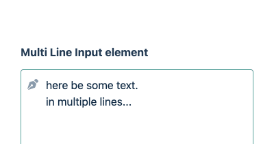
Add and configure Multi Line Input Element in WPEForm
Multi line input is the textarea element with advanced styling and features. It lets you collect multi line text input from user. CHANGING PLACEHOLDER AND ICON From INTERFACE tab, you can change …
Continue Reading…

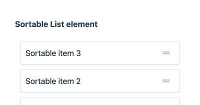
Add and configure Sortable Element in WPEForm
Let the user sort a list of items. Especially useful for quizzes and asking for preferences. ADDING SORTABLE ITEMS Go to INTERFACE tab and from there you can add as many items to the list you want.…
Continue Reading…

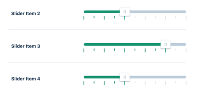
Add and configure Slider Group Element in WPEForm
Use this element to stack other slider elements in a beautiful way. Only the title of the children are taken, rest (subtitle, description etc) are discarded.
Continue Reading…

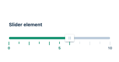
Add and configure Slider Element in WPEForm
Select a numerical value between a given minimum and maximum. Allows custom steps and marks. SET MIN MAX AND STEP From INTERFACE you can setup the minimum, maximum and step values. You can also spe…
Continue Reading…

Add and configure Row Element in WPEForm
Only columns can be added inside ROW CONTAINER only. Use the Row container to visually create layout of your form.
Continue Reading…


Add and configure Single Checkbox Element in WPEForm
Single checkbox is great for on/off type user input. Use it to take user consent on your terms and conditions or acknowledgements. Changing Labels and Icon The icon used in Checkbox can be changed fr…
Continue Reading…


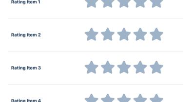
Add and configure Rating Element in WPEForm
Rating with stars, emojis or custom icons with optional feedback. Great to rate your products and services with a testimonial. SETUP RATING TYPE AND ICONS From INTERFACE tab, you can setup which ic…
Continue Reading…

Add and configure Rating Group Element in WPEForm
Use this element to stack other rating elements in a beautiful way. Only the title of the children are taken, rest (subtitle, description etc) are discarded.
Continue Reading…

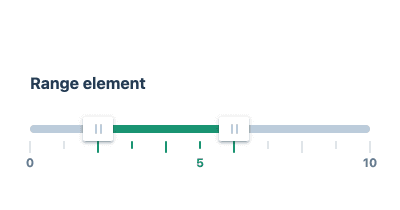
Add and configure Range Element in WPEForm
Select a range of numeric values between a given minimum and maximum. Allows custom steps and marks. SET MIN MAX AND STEP From INTERFACE you can setup the minimum, maximum and step values. You can …
Continue Reading…

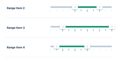
Add and configure Range Group Element in WPEForm
Use this element to stack other range elements in a beautiful way. Only the title of the children are taken, rest (subtitle, description etc) are discarded.
Continue Reading…

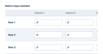
Add and configure Matrix Input Element in WPEForm
Group of text or textarea in a tabular format. Useful to take feedback of related topics. ADDING ROWS AND COLUMNS Rows and columns can be added through their respective tabs. For every column you can…
Continue Reading…

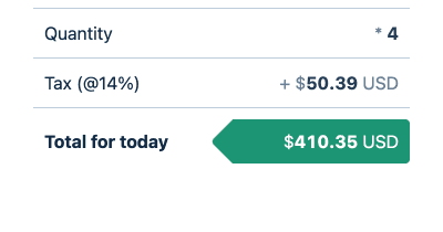
Add and configure Mathematical Group Element in WPEForm
Use this element to stack other mathematical output elements in a beautiful way. Apply the following configuration within the individual elements inside the group. Tabular elements after one another…
Continue Reading…

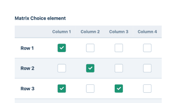
Add and configure Matrix Choice Element in WPEForm
Group of checkbox or radio elements in tabular format. It is like rating or Likert scale to take input on similar fields. ADDING ROWS AND COLUMNS Rows and columns can be added through their respect…
Continue Reading…


Add and configure Mathematical Output Element in WPEForm
This outputs numbers using mathematical formula involving other form elements. This element can be used for any sort of calculations, like cost, days, significance etc. IF YOU NEED TO STACK MULTIPLE …
Continue Reading…


Add and configure Heading & Article Element in WPEForm
If you want to put just some rich text in your form, this is the element for it. By default it will show heading and icon, how-ever you can configure it from APPEARANCE . SHOWING ARTICLE Go to appea…
Continue Reading…

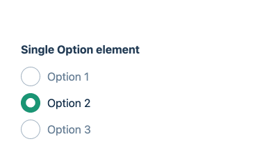
Add and configure Single Option Element in WPEForm
Select one option from a list of options. This is the input[type="radio"] element with advanced styling. Use this when you have small number of options the user could select from. For larger option…
Continue Reading…

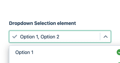
Add and configure Dropdown Element in WPEForm
Let user choose one or multiple items from a list. This is equivalent of the select HTML Form element with advanced styling and experience. Interface From interface, you can set the options of the …
Continue Reading…

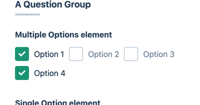
Add and configure Question Group Element in WPEForm
Allows you add any number of elements inside it. The title of the Question Group element is shown along with dividers.
Continue Reading…


Add and configure Datetime Element in WPEForm
Take user's input of date or time or both. SETTING INPUT TYPE AND FORMAT Go to INTERFACE configuration and set the Picker type from there. Depending on the type, you can set these additional opti…
Continue Reading…
Add and configure Column Element in WPEForm
Columns can be added inside ROW CONTAINER only. You can change the width as you see fit and add any number of elements inside it.
Continue Reading…

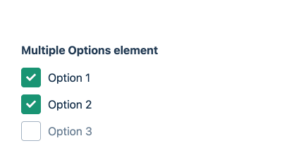
Add and configure Multiple Options Element in WPEForm
Select multiple options from a list of options. This is the input[type="checkbox"] element with advanced styling. Use this when you have small number of options the user could select from. For larg…
Continue Reading…

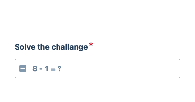
Add and configure Captcha Element in WPEForm
The built-in captcha element is a great way to keep bots away from your form. Just add this element and you're good to go. There is no configuration needed. The element will show a simple math formul…
Continue Reading…

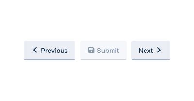
Add and configure Button Element in WPEForm
Button elements are used to navigate between pages or open a link. With this element you can add multiple buttons which can be aligned to your preferences. ADDING BUTTONS Go to BUTTONS from config …
Continue Reading…

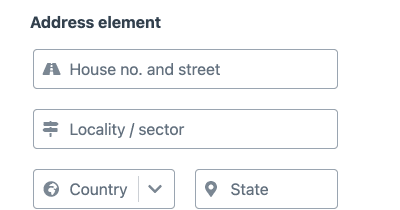
Add and configure Address Element in WPEForm
Address element is very useful for collecting full shipping/billing address from your users. It has built-in support for Address lines, Country, State, City and Zip codes. You can customize to includ…
Continue Reading…