Select one option from a list of options. This is the input[type="radio"]
element with advanced styling. Use this when you have small number of options
the user could select from. For larger options, use the Dropdown element.
INTERFACE

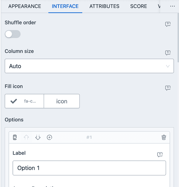
From interface, you can set the options of the radio element. Scroll to the Options control and add your options through the interface. There are also a few interesting configuration available here.
- Shuffle order - Enable this to shuffle the option list when presenting to the form. Useful for quizzes.
- Column size - By default options render next to each other, taking up space as required. You can change this behavior here.
PREFIL AND DEFAULTS
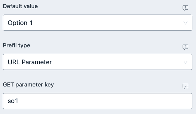
From ATTRIBUTES you can set default values and URL/META based prefils. Here is an example of URL parameter based prefil.

With the above settings, you can navigate to the URL with ?so1=Option+2 to
have Option 2 pre-selected. Do note, the match is against the text of the
option label, all lowercased. If not present, then Option 1 will be selected
by default.
SCORE
Single Option element allows for automated scoring. Based on some condition, score can be added to any of the outcomes. Only one type of comparison is present.
- EQUAL TO - Will be true only when the given option(s) are selected, no more, no less.
NUMERIC VALUE

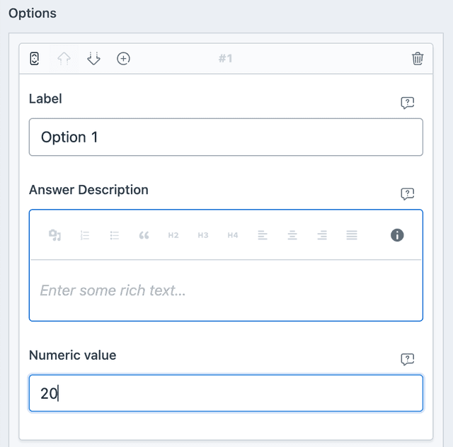
Options can have numeric values assigned to them. These values are recalled when used in Mathematical Output element. See the screenshot to know how to add a numeric value from INTERFACE.
CONDITIONAL EVENT
- VALUE - Will be true when user selected value matches the given value.
- LENGTH - Will be true when user selects an option and you've set compare value to 1. Note that, the length of Single Option can be either 0 or 1.