Toggle option is great for on/off type user input. It can either be selected or not selected.
CHANGING LABELS AND ICONS
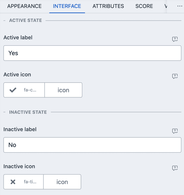
On and off state labels and icons can be changed through the INTERFACE tab.

- The labels are used in recall and in summary page.
- Icons are shown in the toggle UI.
PREFIL AND DEFAULTS
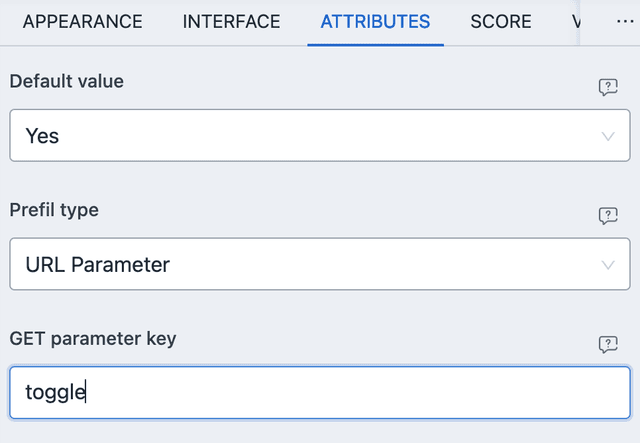
From ATTRIBUTES you can set default values and URL/META based prefils. Here is an example of URL parameter based prefil.

With the above settings, you can navigate to the URL with ?toggle=true then
the toggle will be enabled by default. The value can be either of the
followings:
true- Set the toggle element enabled.false- Set the toggle element disabled.
Any other value is rejected and falls back to the default value.
For meta based prefil, the user metadata must have a value that matches with the active/inactive label of the element.
SCORE
Toggle element allows for automated score. The value can be compared with the user input.
- EQUAL TO - Works when user input is same as given value (either selected or unselected).
NUMERIC VALUE
When the toggle element is enabled, it has a numeric value of 1, otherwise it
is 0.
CONDITIONAL EVENT
Only VALUE based events are considered. It can either be EQUAL TO the selected state or unselected state (just like score).